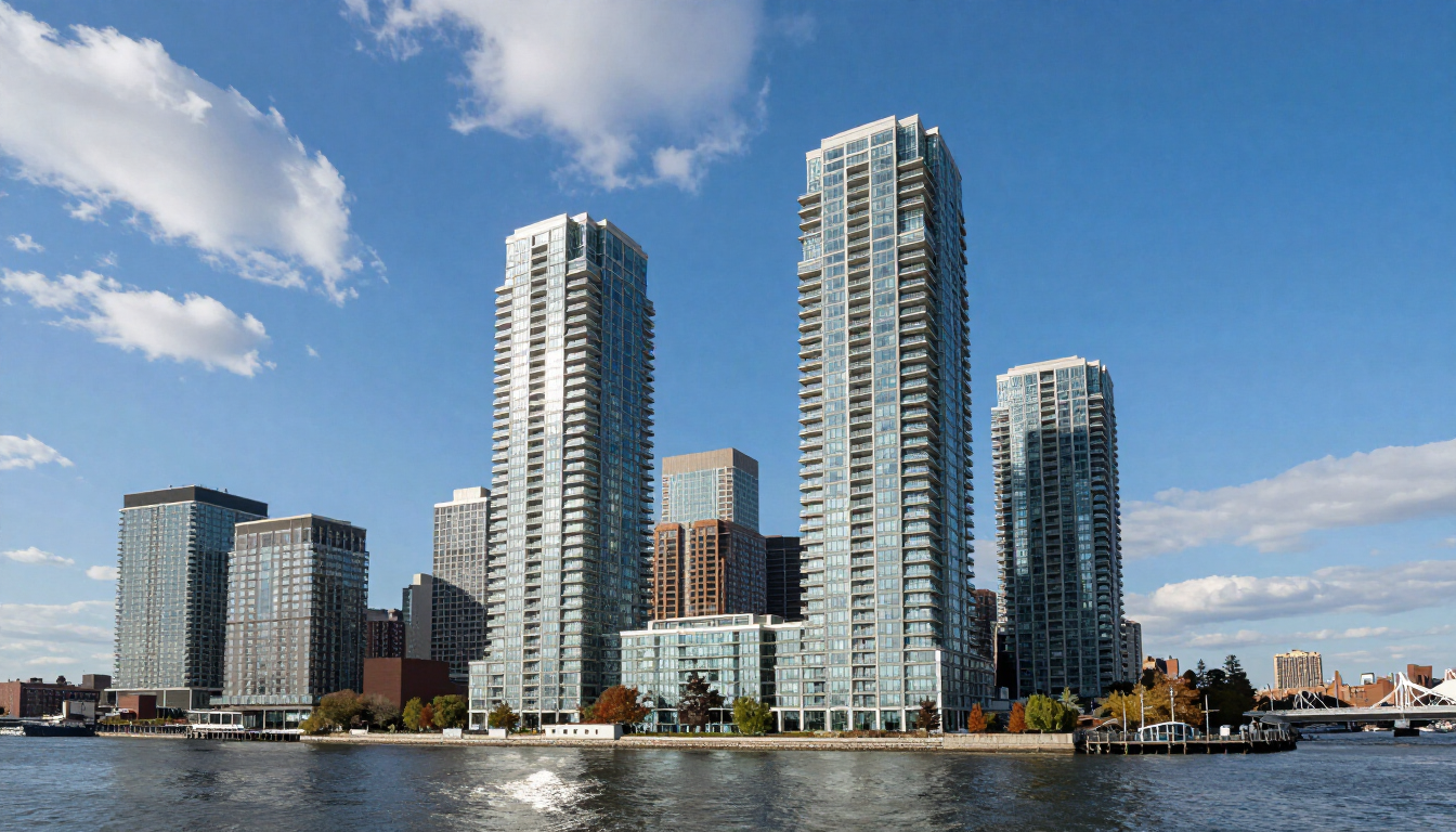
Weehawken's waterfront condos enjoy some of the most spectacular views in the New York metro area. Here's how to choose paint colors that amplify those views and complement the architecture.
Designing for the View: Color in Weehawken's Waterfront Condos
Weehawken's Port Imperial waterfront development offers something rare in the New York metro region: floor-to-ceiling views of the Hudson River, Manhattan's midtown skyline, and some of the most dramatic sunrise and sunset light in the entire area. Painting a Weehawken waterfront condo isn't just about choosing colors you like — it's about choosing colors that work with the extraordinary light conditions and visual backdrop that make these properties worth owning in the first place.
As Weehawken's experienced painting contractors, we've transformed dozens of Port Imperial and Boulevard East condos. Here's what we've learned about color in these exceptional spaces.
Understanding Weehawken's Waterfront Light
Light in a Weehawken waterfront condo shifts dramatically through the day — and that shift has a profound impact on how paint colors appear. East-facing units receive bright, blue-tinged morning light that makes cool colors and clean whites feel crisp and energizing. South and west-facing units get warmer afternoon and evening light that makes earthy tones glow and can make stark whites feel slightly harsh. Understanding which direction your unit faces is the essential first step in any color decision.
The water itself introduces an additional variable: on clear days, the reflected light off the Hudson River introduces a blue-green cast that affects how colors in adjacent rooms read. Warm paint tones near windows compensate for this effect; cool tones can feel chilly on overcast days.
Color Palettes That Work in Weehawken Waterfront Condos
For Maximum View Enhancement: Soft, Recessive Neutrals
The most sophisticated approach in a view unit is to let the window be the art — using quiet, recessive wall colors that don't compete with the panorama outside. Our top recommendations for this approach:
- Benjamin Moore Pale Oak (OC-20) — A warm, barely-there greige that works beautifully with both warm wood floors (common in Port Imperial units) and cool gray tile. Reads differently across the day without ever feeling wrong.
- Sherwin-Williams Accessible Beige — The most versatile neutral we use in Weehawken. Warm enough to feel welcoming without yellow undertones that conflict with the river light.
- Benjamin Moore White Dove (OC-17) — The definitive warm white for high-ceilinged modern condos. Clean and fresh without the sterile coldness of pure white; enhances the sense of space that makes waterfront condos feel expansive.
For Living Areas With River Views: Soft Blues and Aquas
A counterintuitive but effective choice for east and south-facing units: soft blues and aquas that bridge interior and exterior, creating a seamless visual connection with the river and sky:
- Benjamin Moore Sea Salt (2123-40) — A muted, sophisticated aqua that references the water without feeling nautical or kitschy. Beautiful in open-plan living areas with southern or eastern exposure.
- Sherwin-Williams Quietude — A hushed, misty blue-green that shifts from green to blue depending on the light. Works particularly well in units where the Hudson River is a consistent visual presence.
For Bedrooms: Warm, Enveloping Tones
Weehawken waterfront bedrooms that face away from the primary view benefit from warmer, more intimate tones that create a cocooning effect separate from the dramatic main living spaces:
- Benjamin Moore Dusty Mauve — A soft, sophisticated pinkish gray that reads warm and restful without feeling dated
- Sherwin-Williams Antique White — For bedrooms where you want warmth and light simultaneously, this classic tone delivers
- Benjamin Moore Hale Navy — For a dramatic master bedroom in a unit with its own water views, deep navy creates a luxurious, hotel-like atmosphere
For Kitchens in Weehawken Condos
Open-plan kitchens in Port Imperial condos typically flow directly into living areas, so wall colors need to work with both the living space palette and the cabinetry finish:
- White or soft neutral walls with white cabinetry — go warmer (White Dove, Chantilly Lace) rather than stark bright white to avoid a clinical feeling
- With gray or charcoal cabinetry — warm greiges (Pale Oak, Revere Pewter) or a single warm white work better than cool grays, which can feel institutional
Building Requirements in Port Imperial
Most of Weehawken's major waterfront condo developments — including The Henley, Riverbend, Hudson Lights, and the Port Imperial South buildings — have specific painting requirements: Certificates of Insurance, elevator protection, designated work hours, and sometimes low-VOC or zero-VOC paint mandates. Hudson Line Painters handles all building logistics as standard practice, including COI submission, elevator booking, and compliance with HOA paint specifications.
Getting the Right Color for Your Weehawken Condo
We offer color consultation as part of every free estimate — we bring sample chips, discuss your unit's light conditions and views, and help narrow down the options before you commit. Seeing colors in your actual space under your actual light conditions is the only reliable way to choose correctly.
Contact our Weehawken team for a free estimate and color consultation. Learn more about our residential painting services and interior painting expertise.